Designflows contest · 2025
Hexabot app
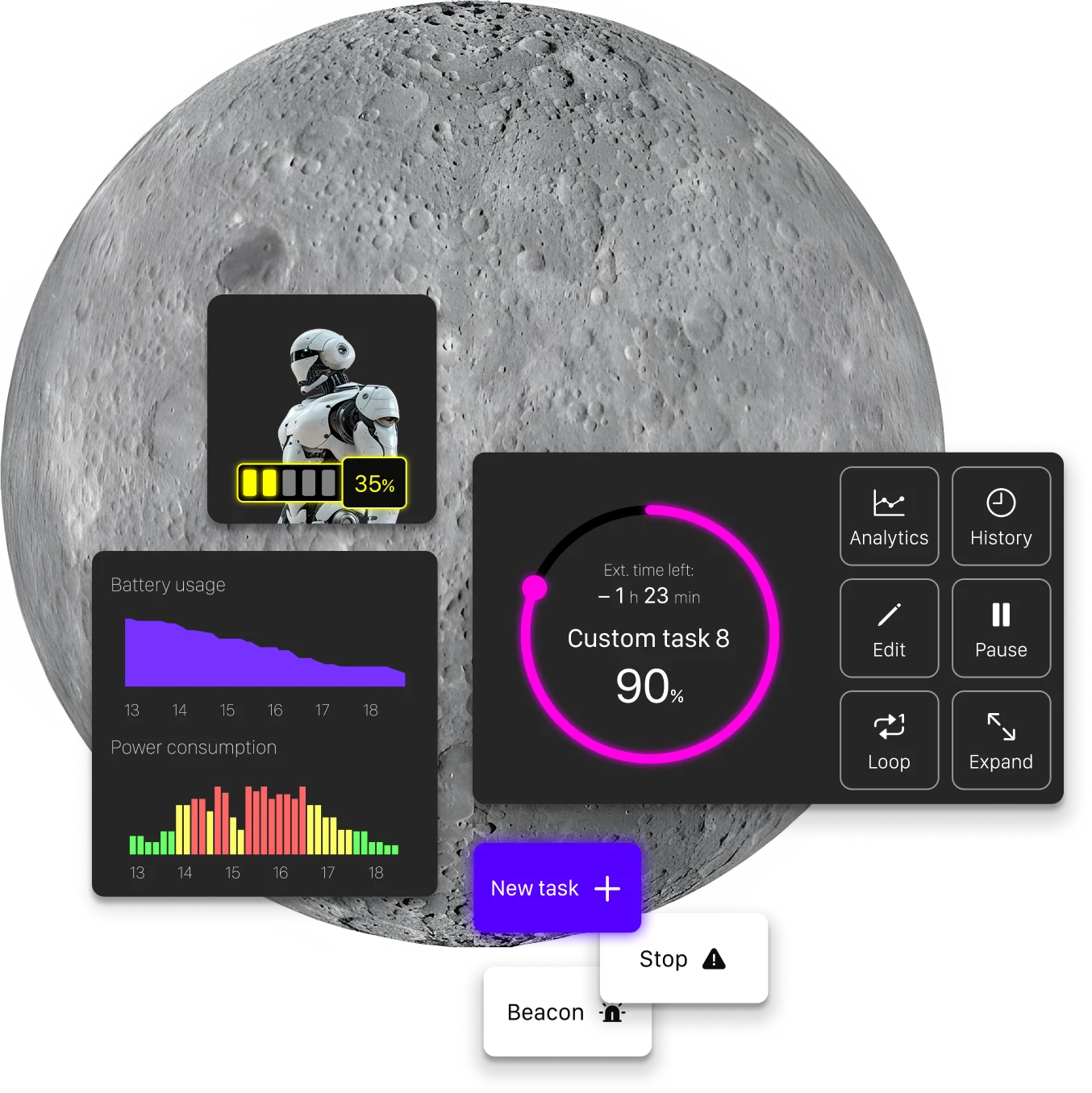
The brief
It's 2025, in a parallel universe, and humanity has been settling the Moon for a decade. Daily life there runs on Hexabots—multi-purpose robots used for everything from mining to growing crops. The mission: an app to assign their tasks, track progress and receive updates in a few taps.
User Insights and Goals
Two profiles use the app: explorers and researchers running mission-critical work, and families relying on Hexabots for everyday tasks. The first need efficiency, the second need it simple.
- Frequent status checks. Users check the status of their Hexabots an average of 7-10 times a day to ensure tasks are progressing as planned.
- Time-sensitive task assignments. About 65% of users assign new tasks to Hexabots in response to urgent needs, often with minimal time for planning.
- Complex operational setting. Users operate in challenging physical conditions, so the interface should be accessible even when users have limited dexterity or time, such as when wearing gloves or a fogged-up helmet.
User Scenario
A science dome team is prototyping a turbine but lacks the materials. They task a Hexabot with gathering them, then track it until it returns.
User Journey
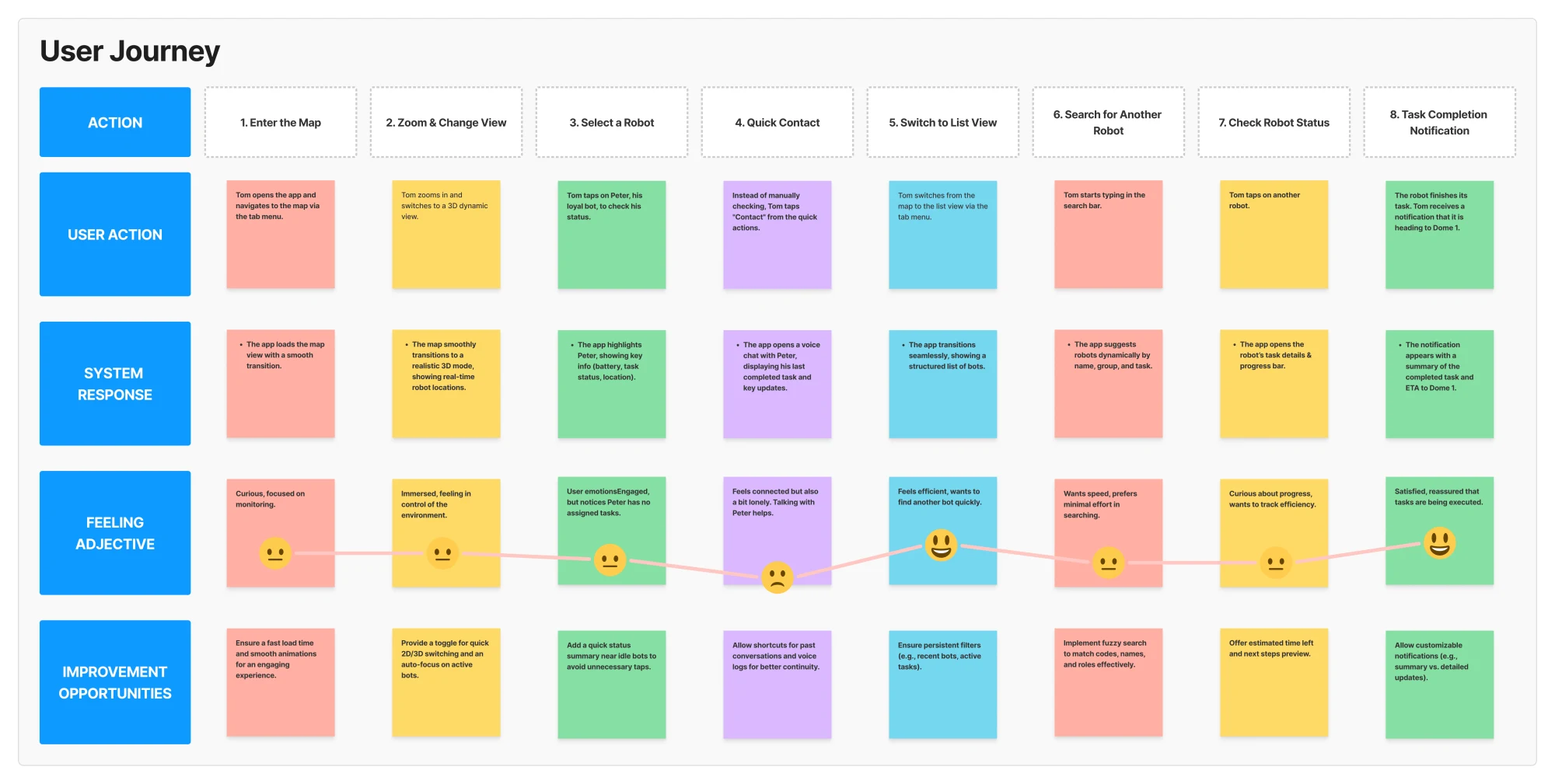
I recreated the user journey of the scenario described in the brief, to break down all the steps the user will go through. This allowed me to focus on more details, including the feelings of the users, and resulted in some good ideas, listed in the improvement opportunities.
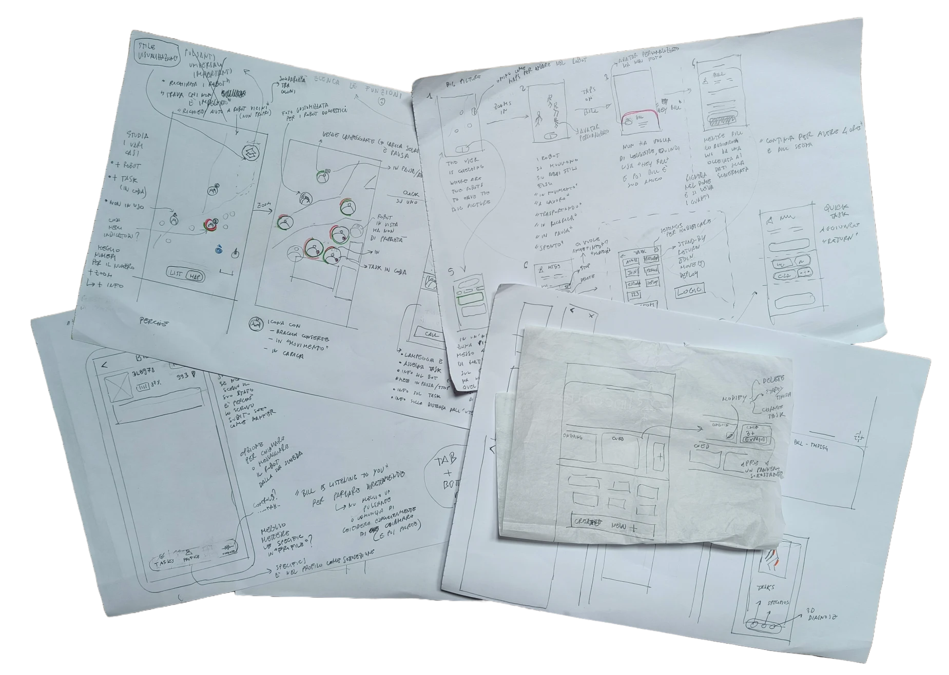
Initial sketches
These hand-drawn sketches serve as the initial wireframe concepts for the project, exploring different layout ideas and interaction patterns. They provide a rough visual representation of key screens and user flows, helping to define structure and functionality before moving to the design software.
The pencil is still the best tool when it comes to catching the speed of our brain.
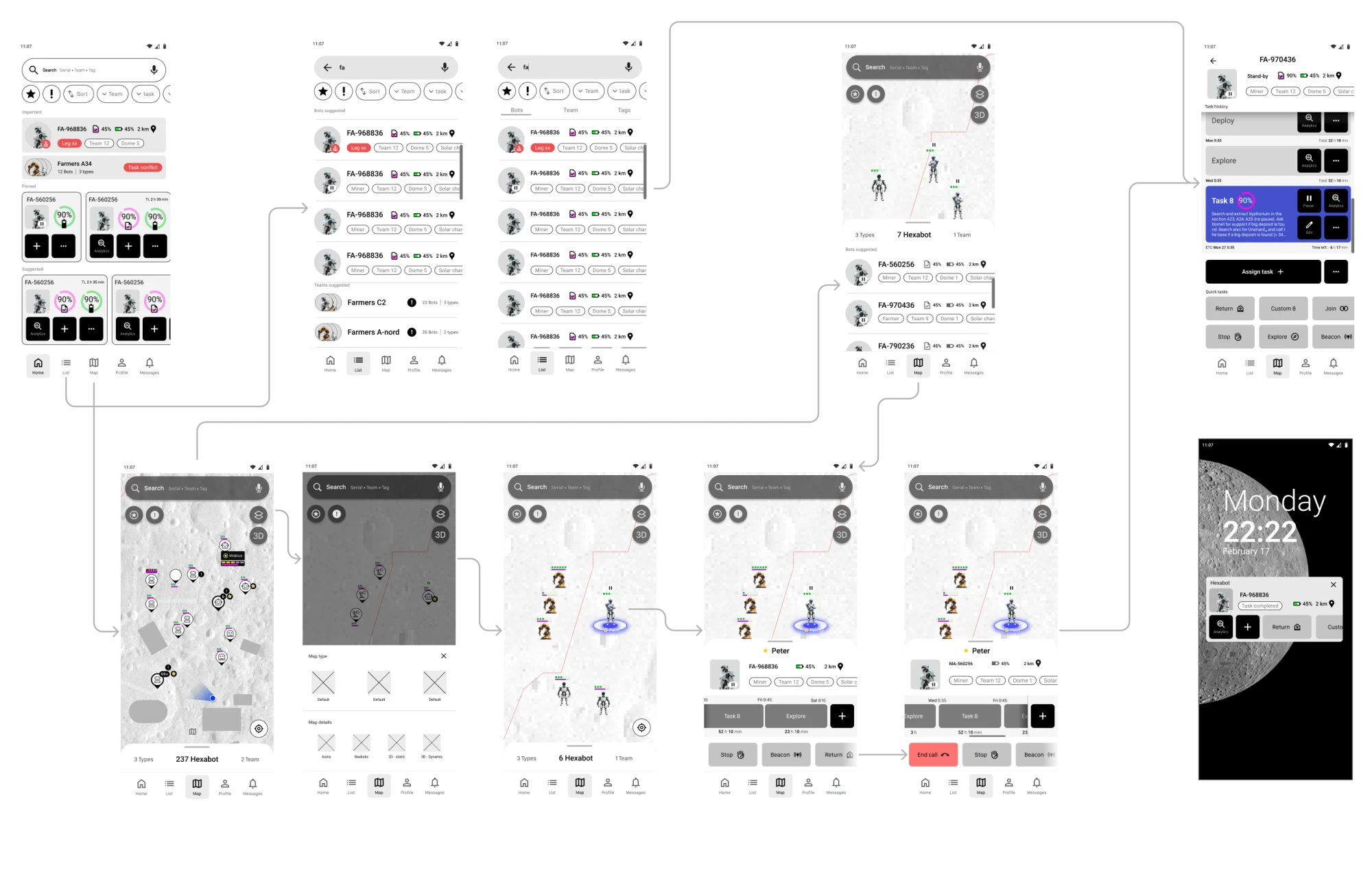
Wireflow mid-fidelity
This wireflow illustrates the user journey of Tom as he navigates the app to monitor and manage Hexabots. It maps out key interactions, such as switching between views, selecting bots, using quick actions, and receiving status updates. The flow highlights how different screens connect to support a seamless experience.
Room for improvement
- The task section in the map view can be complicated to use because of the high cognitive load
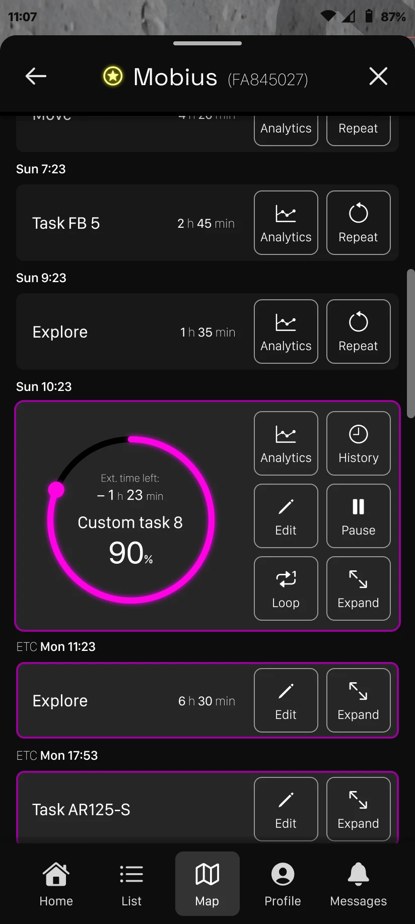
- The task history is a good idea but the main focus should always be on the present moment. The progress of the current task should always be at the top of the visual hierarchy
- The status of the main functionalities of the bot should always be clearly visible (battery and task progress)
Final Designs
My final decision was to go for a default dark mode, since on the moon there are several benefits by adopting this mode. I went for a neon color palette on a dark background, quite appropriate for a futuristic app. I also introduced some improvements based on the list drafted before.
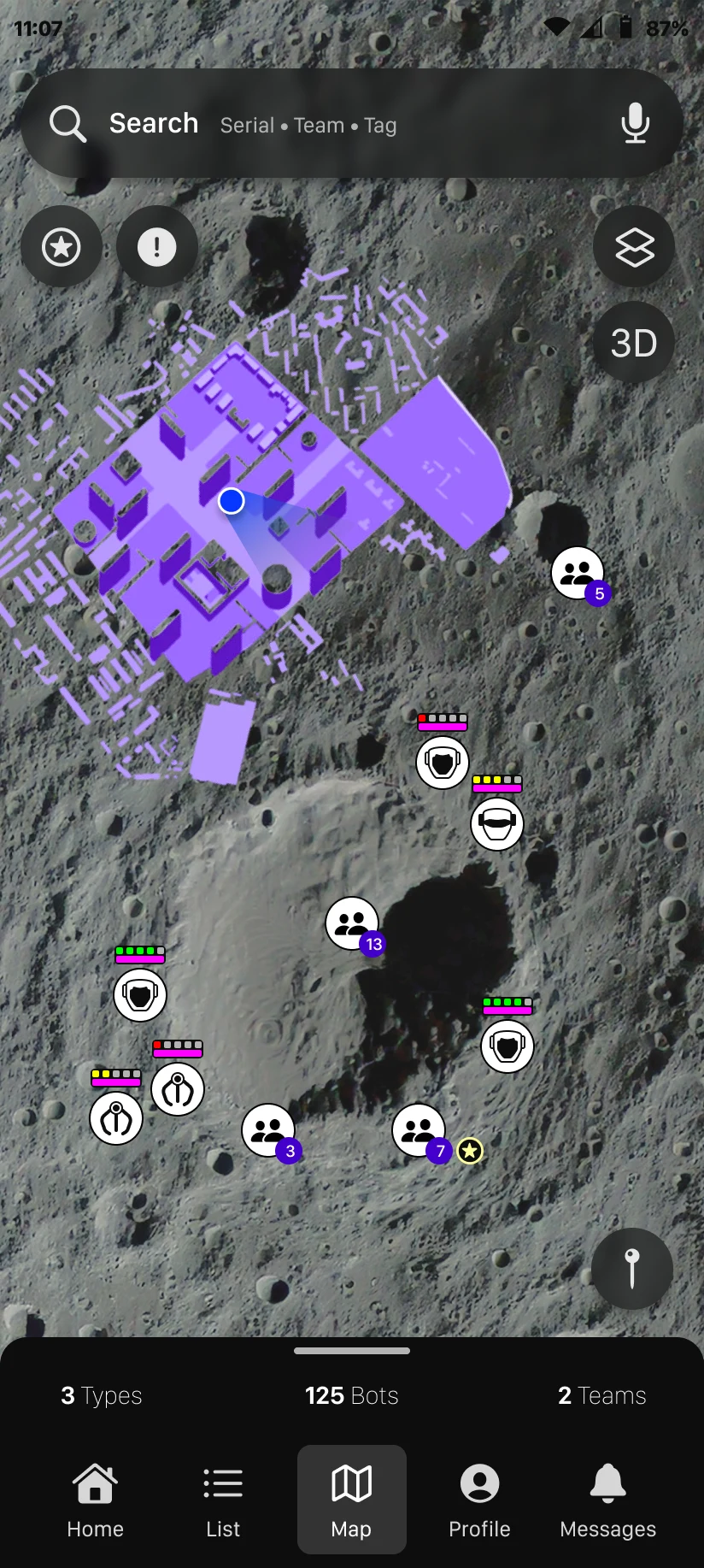
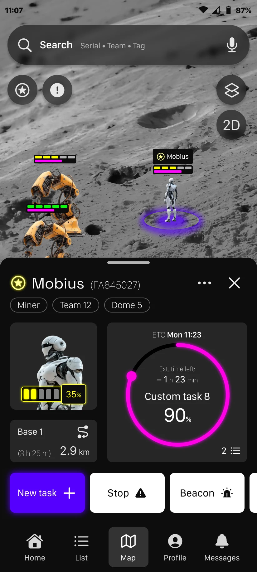
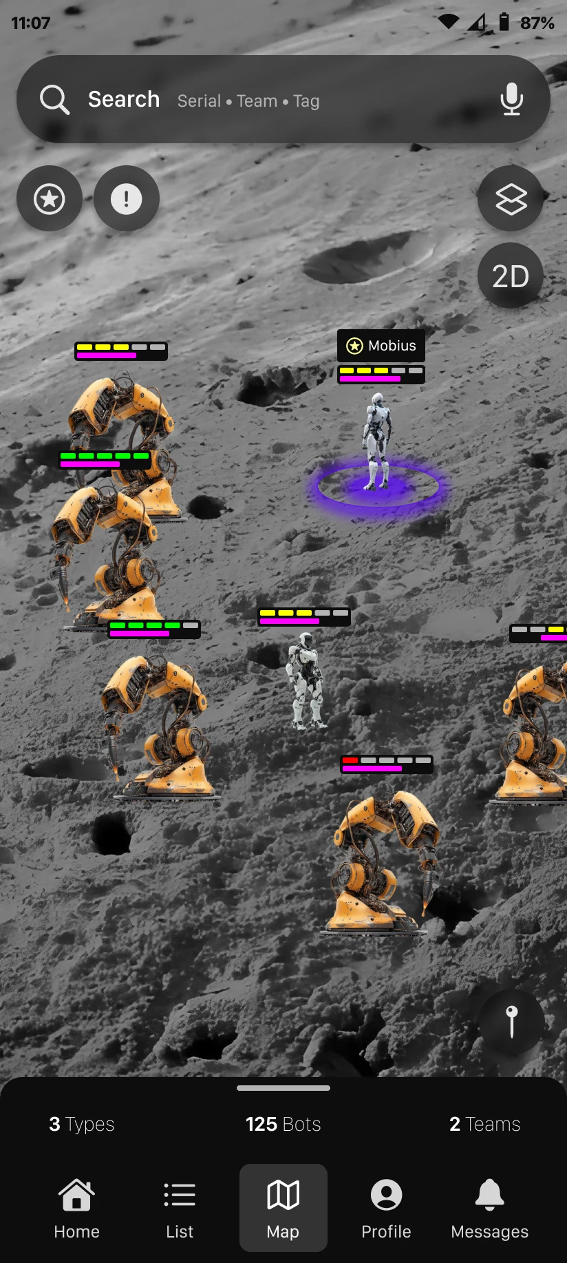
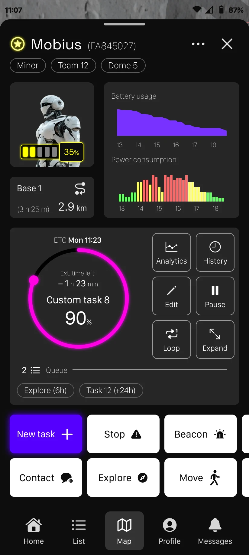
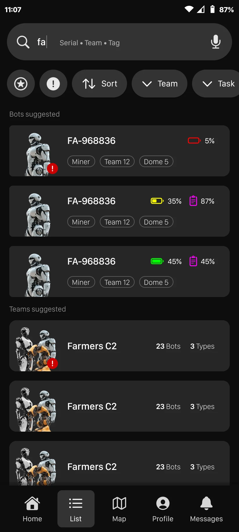
Below are the most relevant high-fidelity screens of the app, which include:
- 2D map with various information about the bots such as number, type, status etc.
- 3D map with a semi-realistic view
- Quick view of a bot in the map visualization, showing essential information
- Expanded view of a bot in the map visualization, displaying more stats and data
- Task history panel for a bot
- List section for efficiently searching for a bot or team
Conclusions
This project has been an exciting challenge, pushing me to refine mobile interfaces that require a high degree of flexibility. Balancing simplicity for everyday users with the complexity needed by specialized operators has been a key focus throughout the design process.
In the end, this leap into the future has been both fun and insightful, offering a glimpse into how intuitive design can shape next-generation interactions.