UserTesting · 2023
Live Conversation Redesign
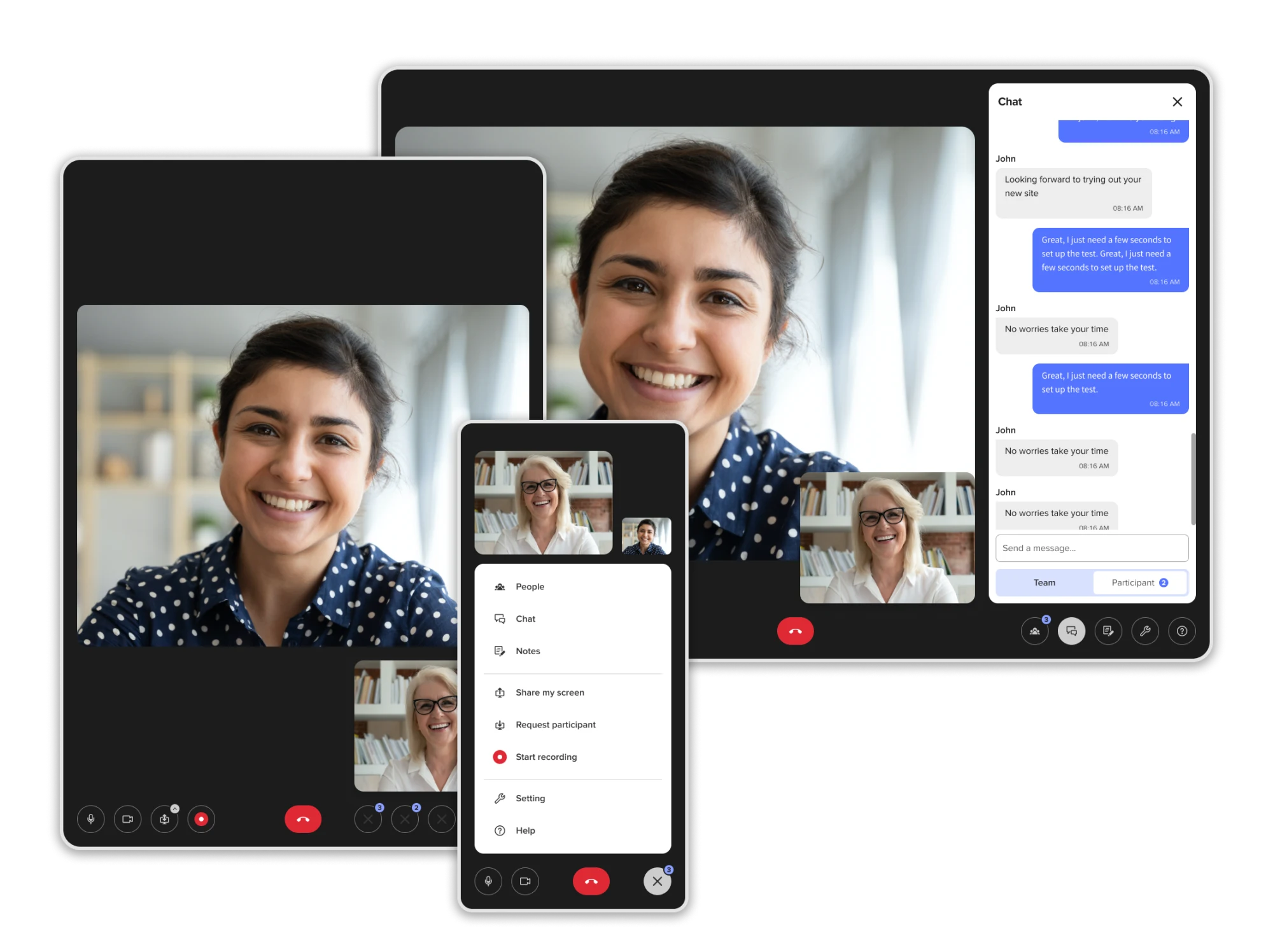
Competitive analysis
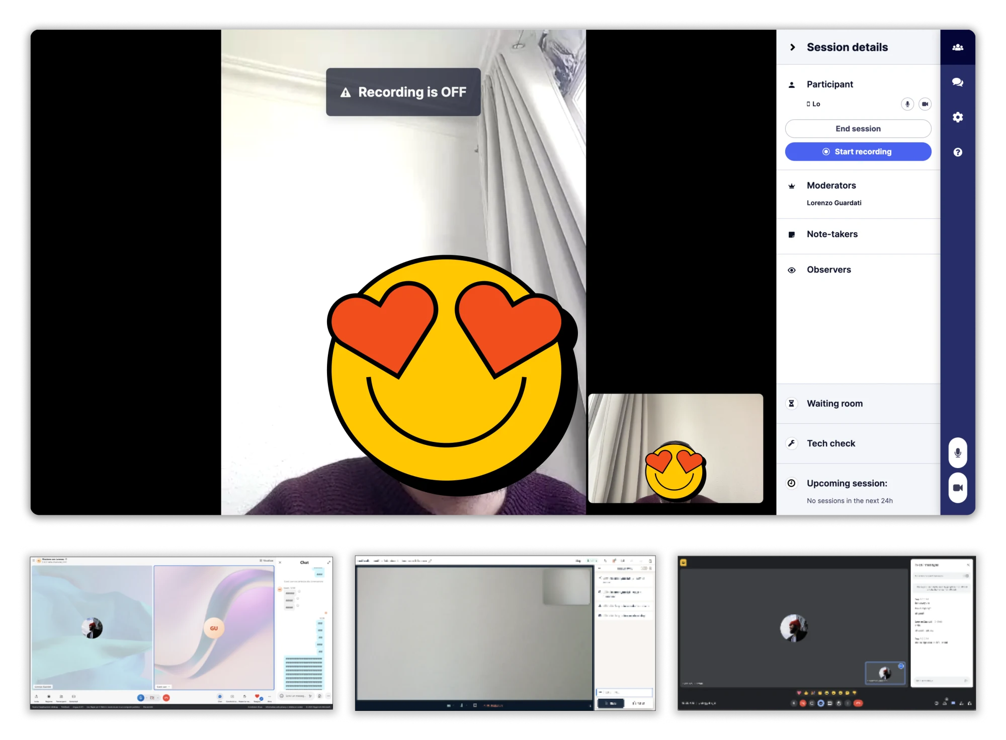
I benchmarked both direct and indirect competitors alongside the two platforms, and gathered feedback from the UX team through interview sessions with experienced users of both. Lookback stood out as the most relevant direct competitor for user interviews, while Skype, Zoom, and Google Meet were the dominant indirect competitors in the market.
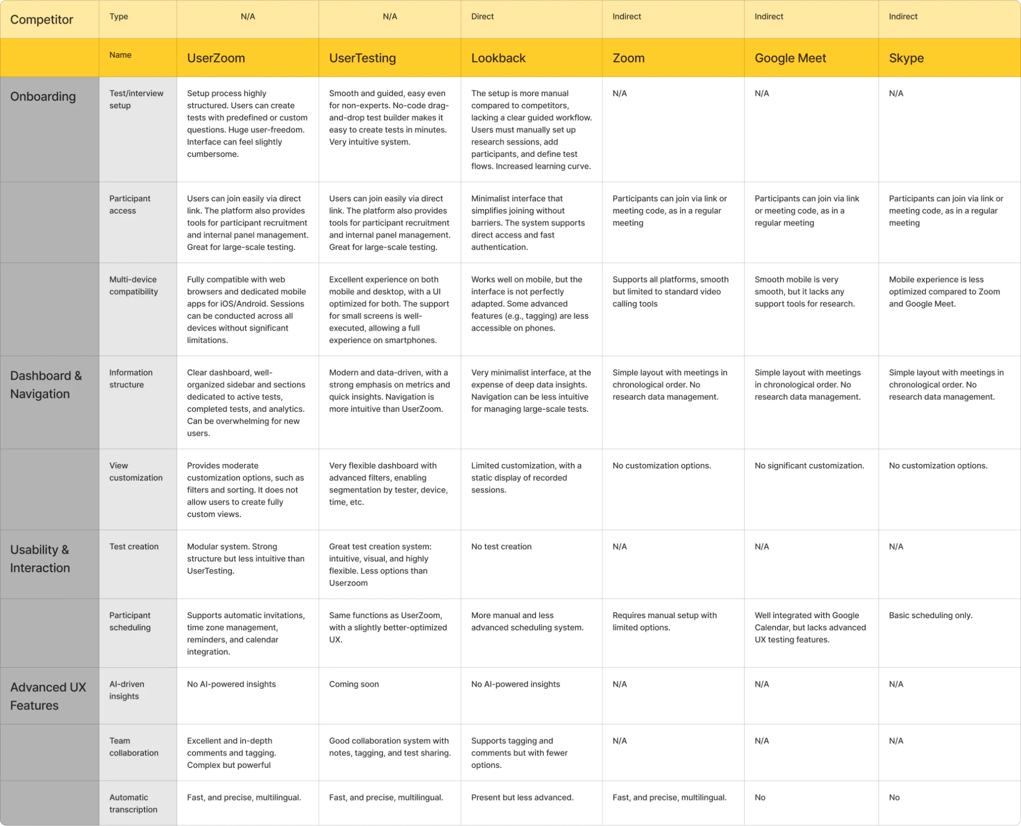
The analysis is divided into four categories based on the most relevant areas to examine: Onboarding, Dashboard and Navigation, Usability and Interactions, and Advanced UX Features. Each category includes subcategories to dive deeper into specific topics, as shown in the following table.
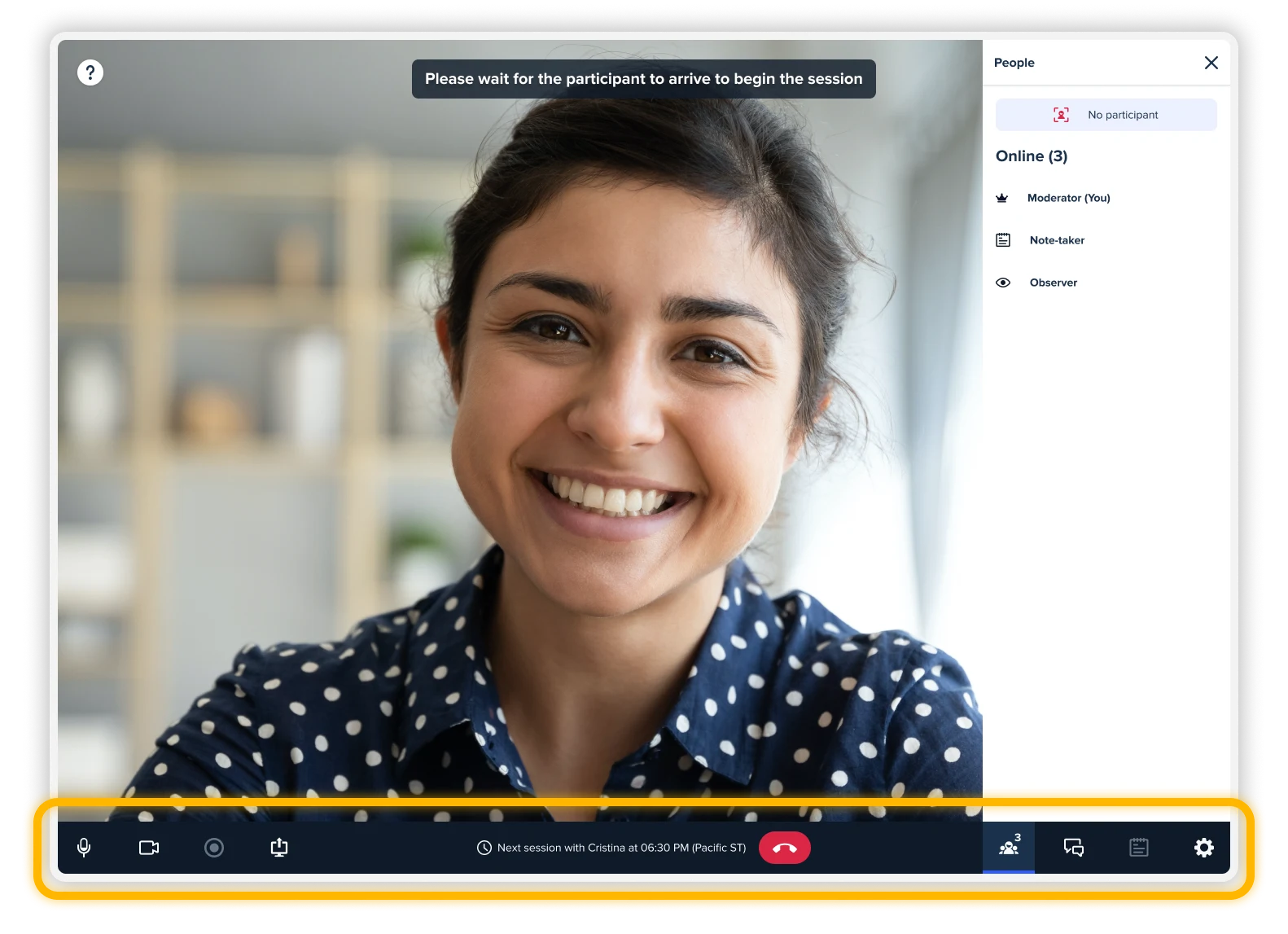
Menu redesign — mid fidelity
The first iteration is a mid-fidelity design, created for quick testing with users. I also worked on the sidebar, but the main focus was on the horizontal menu, which is highlighted in the image below.
Different role, different menu
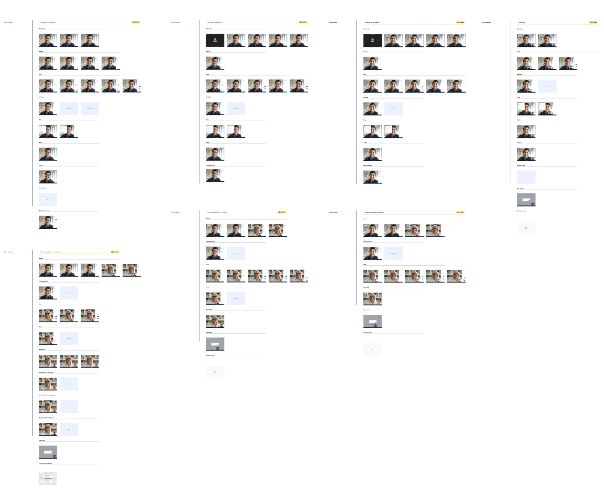
In the live conversation there are different roles: Moderator, Note-taker, Hidden-observer, and Participant. Each one has a slightly different sidebar and menu, so I started to explore all the different configurations possible to figure out any disabled states, notification badges and features to remove (e.g. the "notes" feature in the Participants' menu).
Research
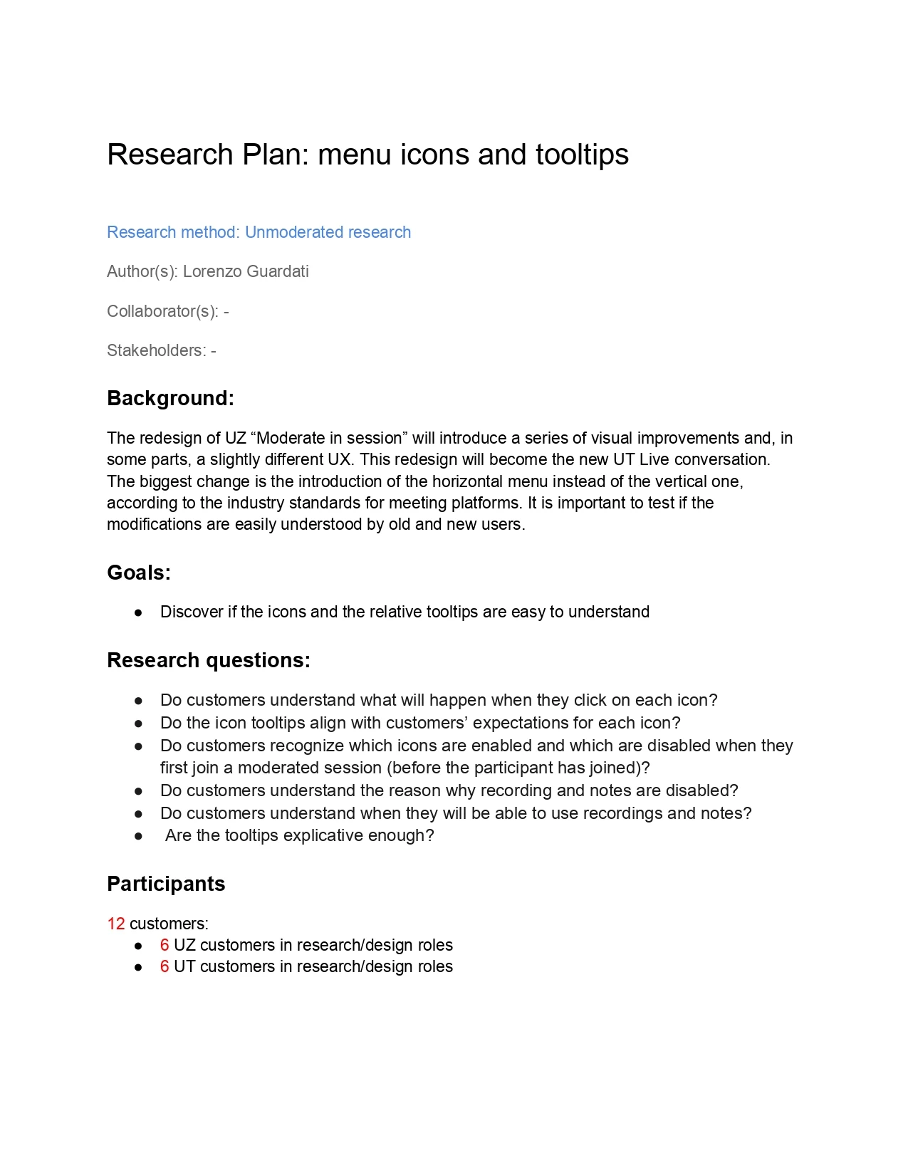
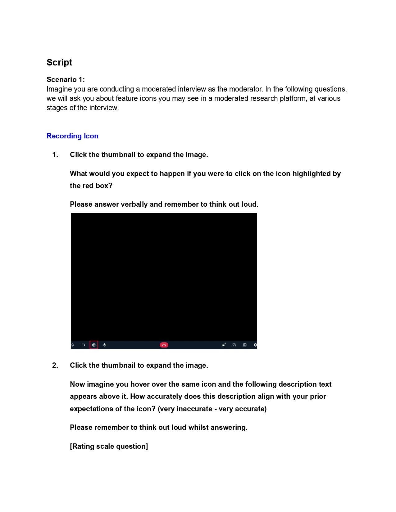
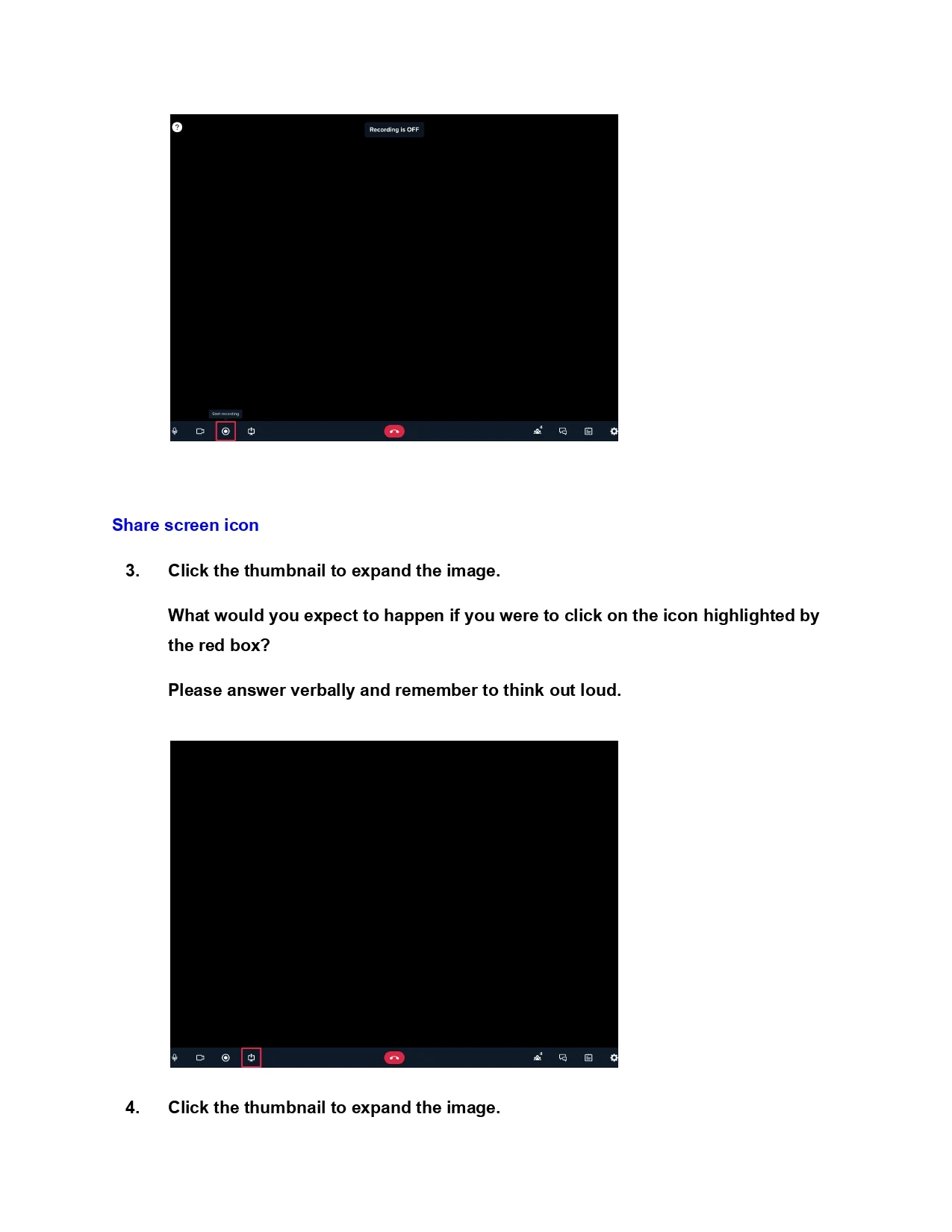
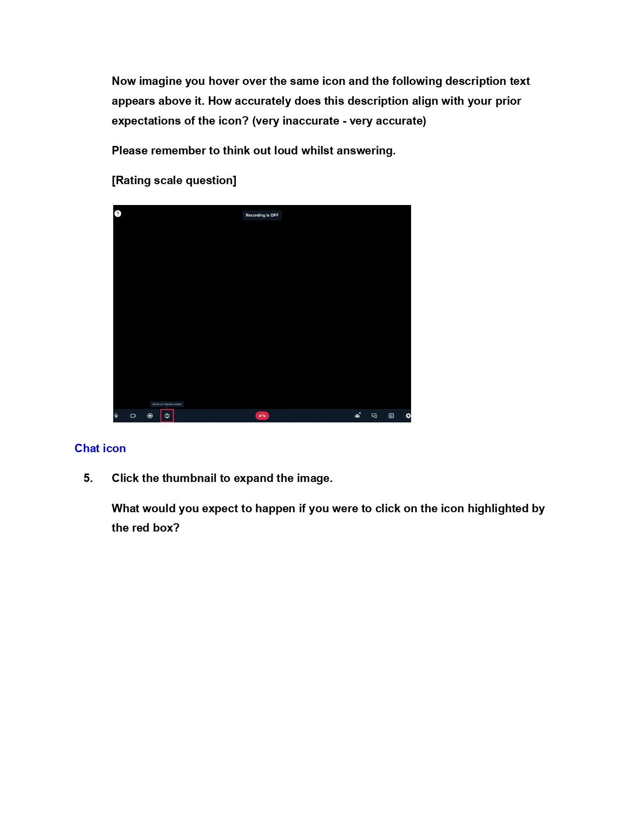
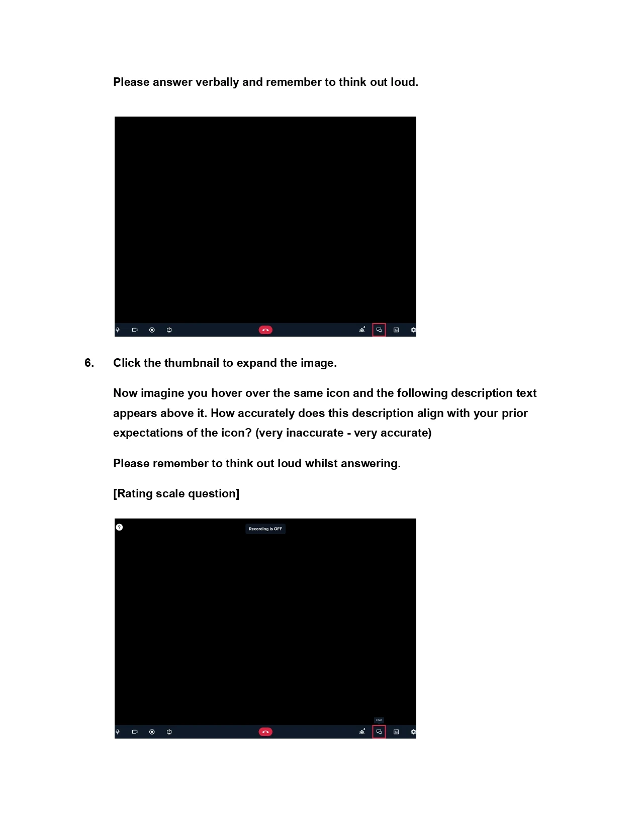
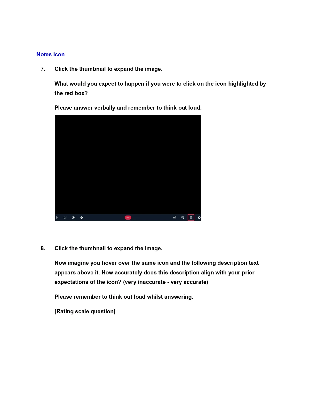
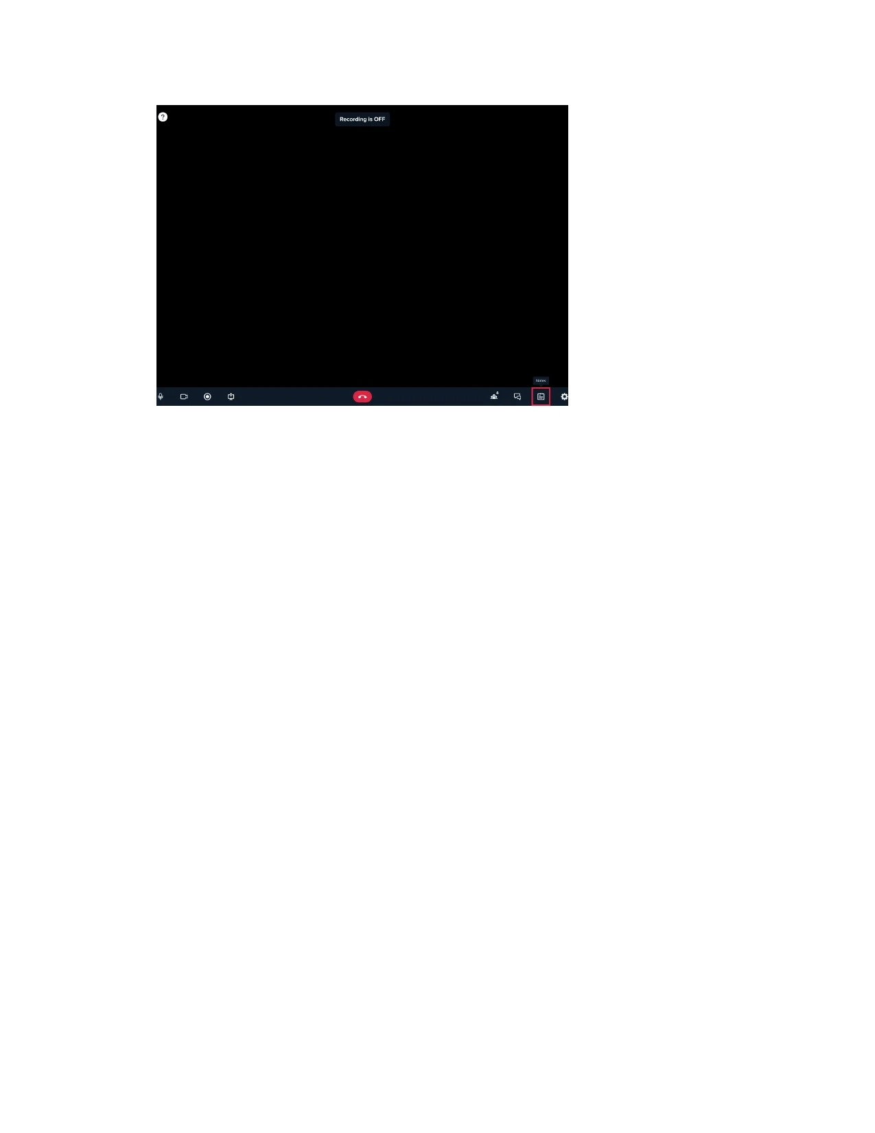
Now it's time to test the understandability of the menu. It is important to assess whether the modifications are easily understood by both new and existing users from UserZoom and UserTesting, as the new design will serve both these groups as well as new users. For this reason, participants from each company were recruited for the study, resulting in a total of 12 participants (13, actually).
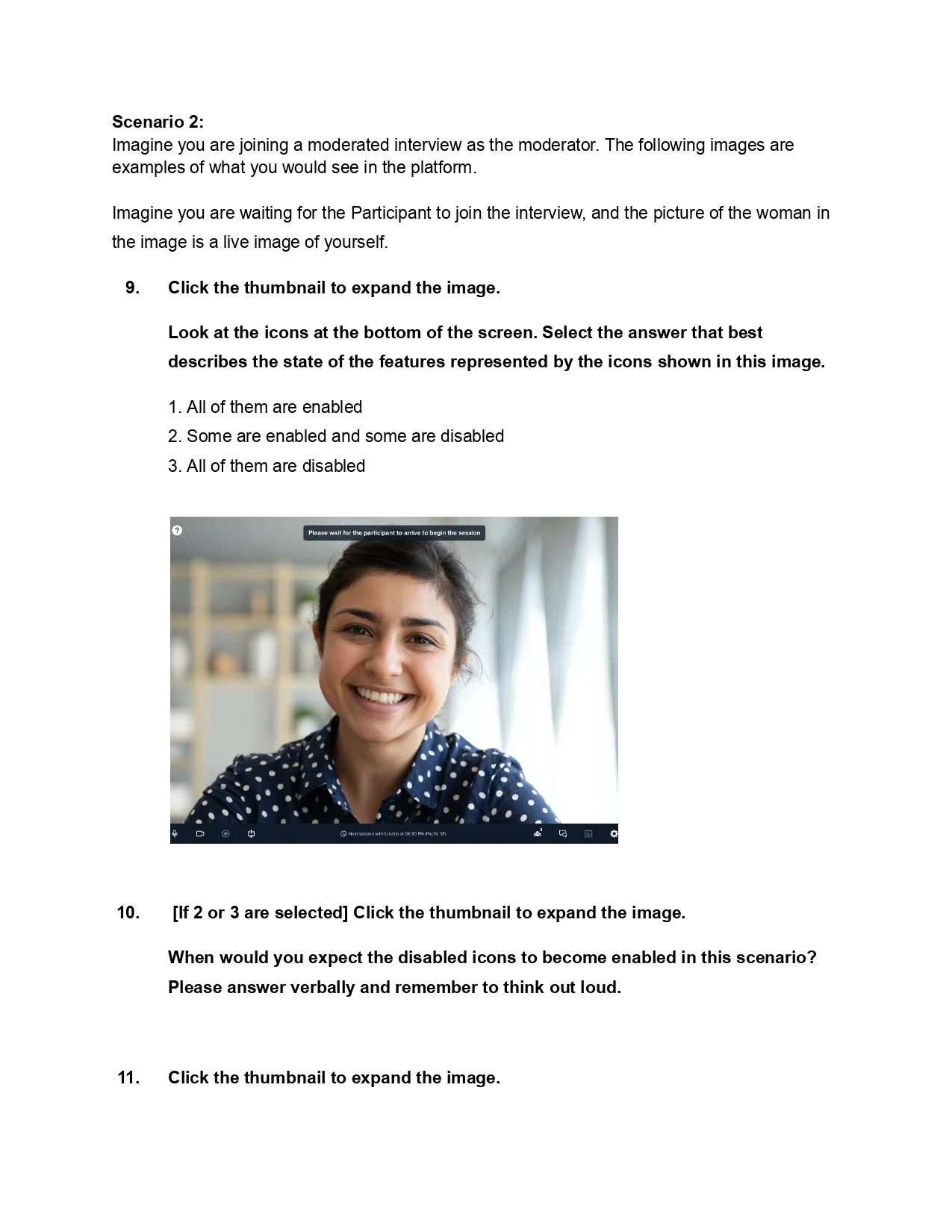
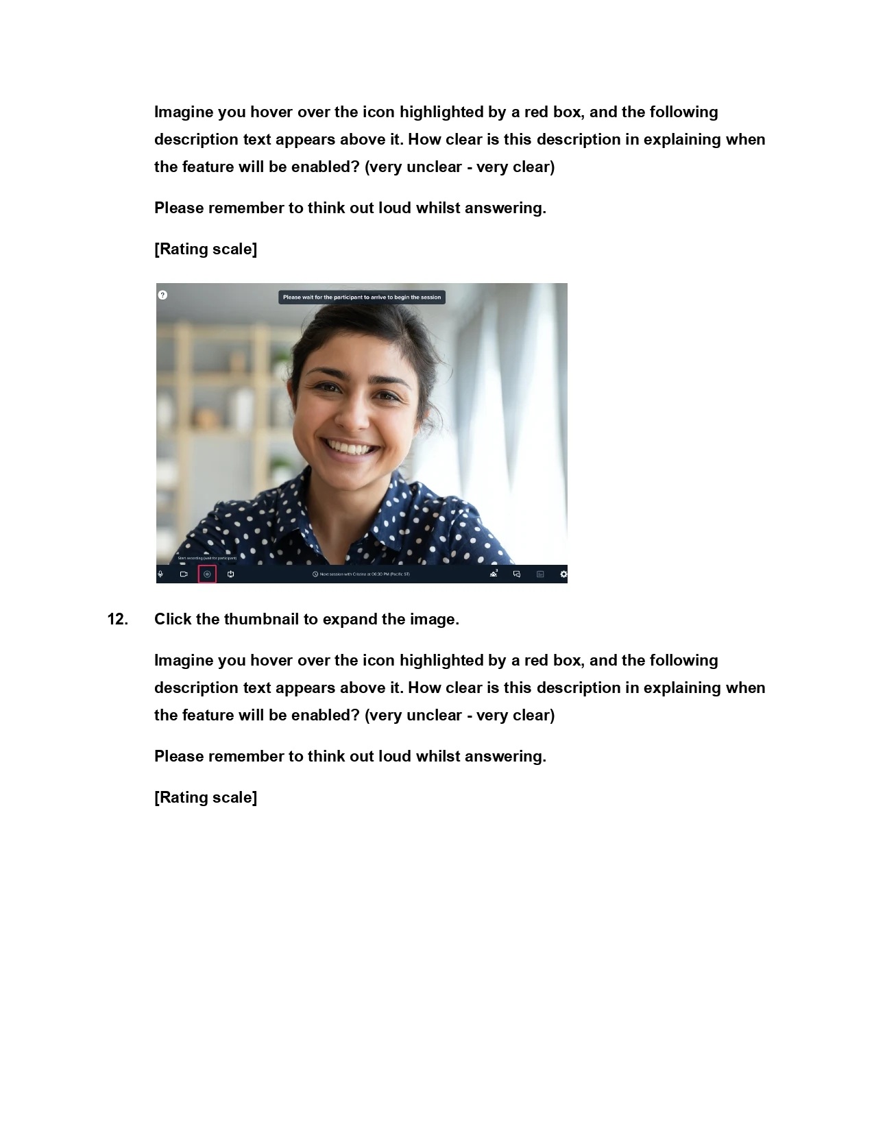
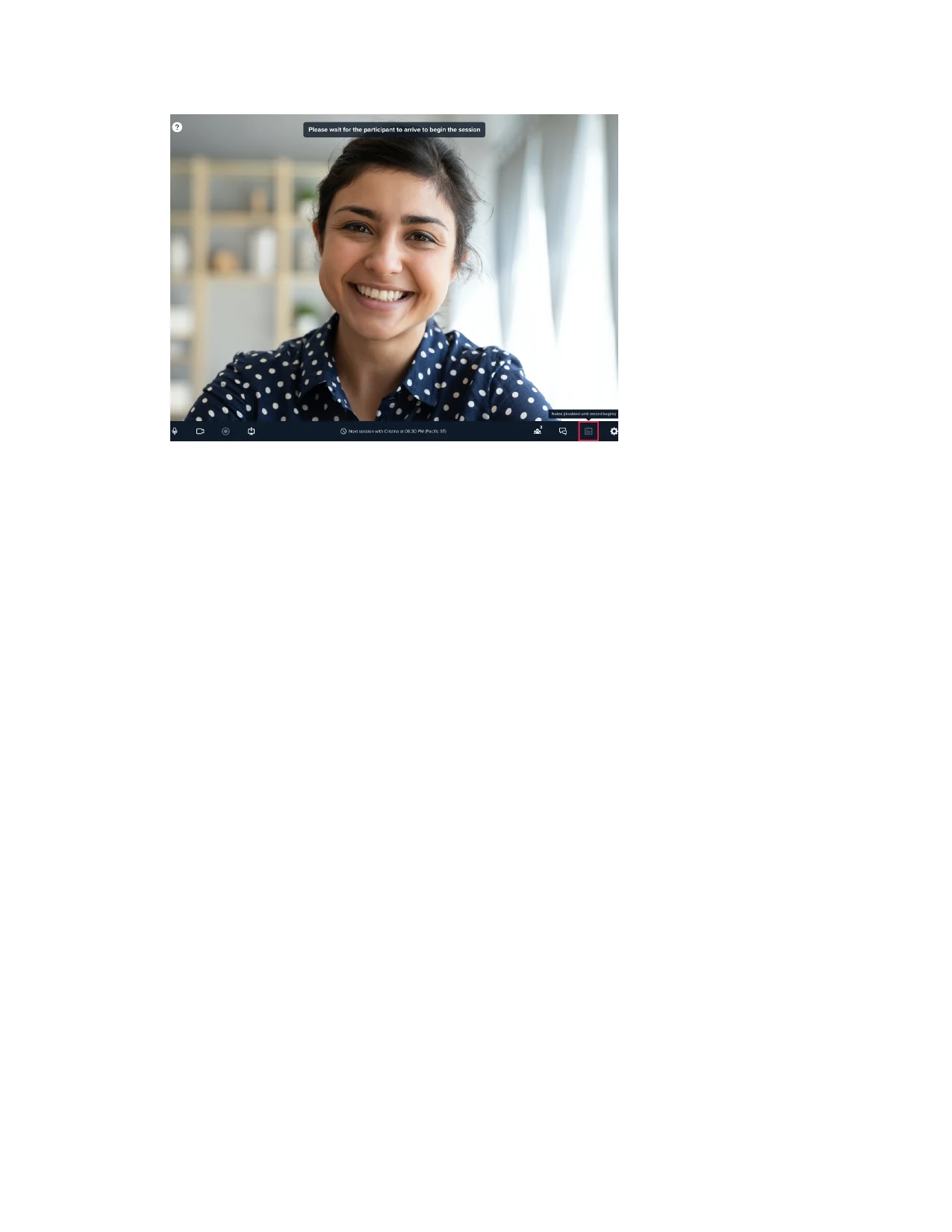
Affinity mapping
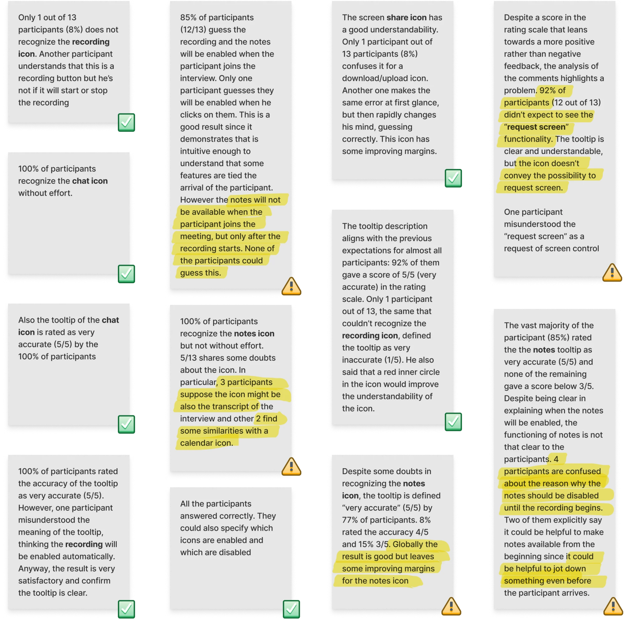
After conducting the UX research, we analyzed the anonymized responses from the participants and grouped similar feedback and observations to identify trends, common themes, and key pain points across both UserZoom and UserTesting users.
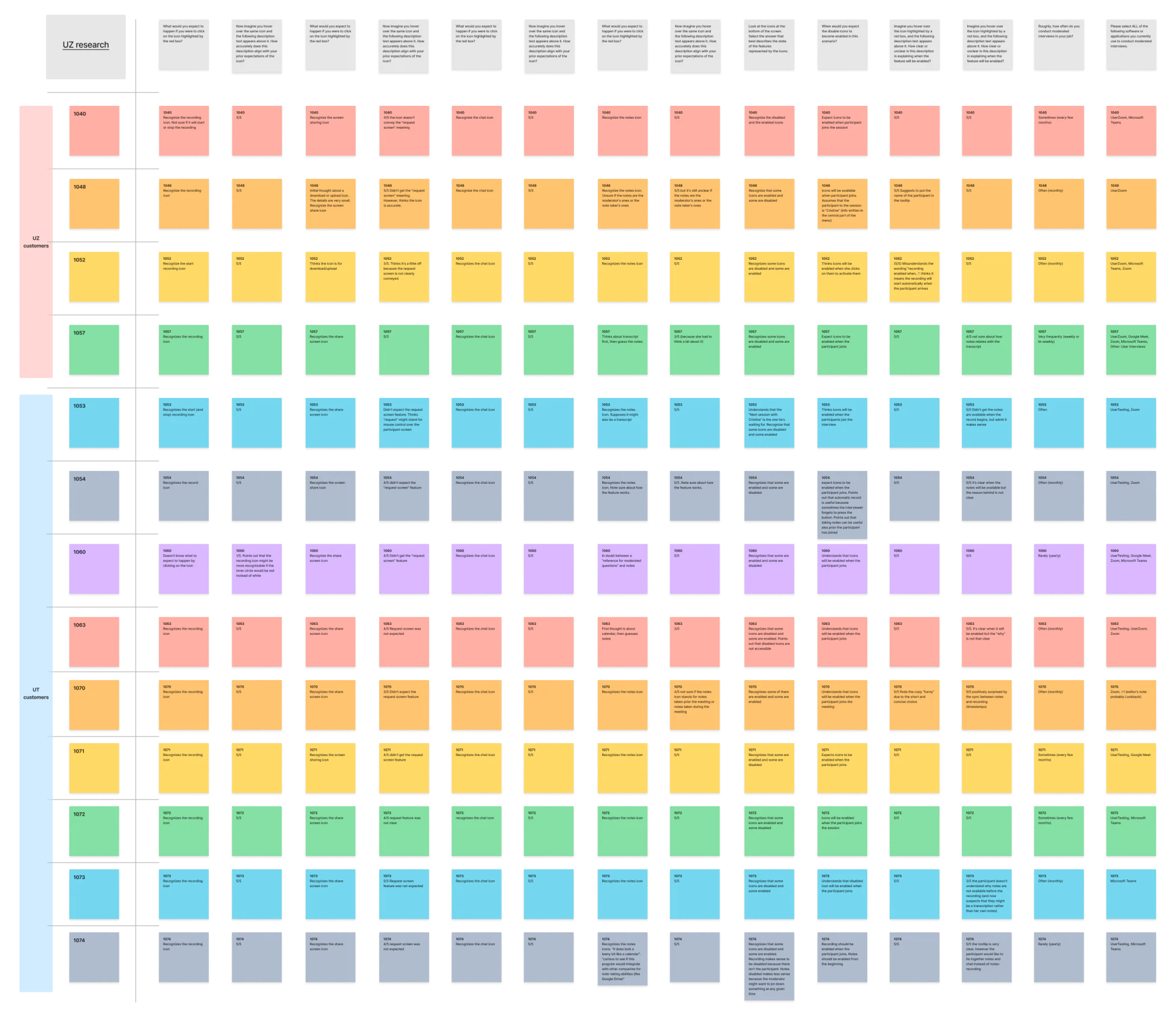
Insights — problems highlighted
Request screen functionality and icon
92% of participants (12 out of 13) didn't expect to see the "request screen" functionality. The tooltip is clear and understandable, but the icon doesn't convey the possibility to request the screen.
Notes icon confusion
Notes icon is confused with transcript (3/13) or calendar (2/13).
Notes icon and enable state
None of the participants could guess that notes would be available after the recording of the session starts, and 4 were confused about the reason for notes being disabled until recording.
Iterate on design
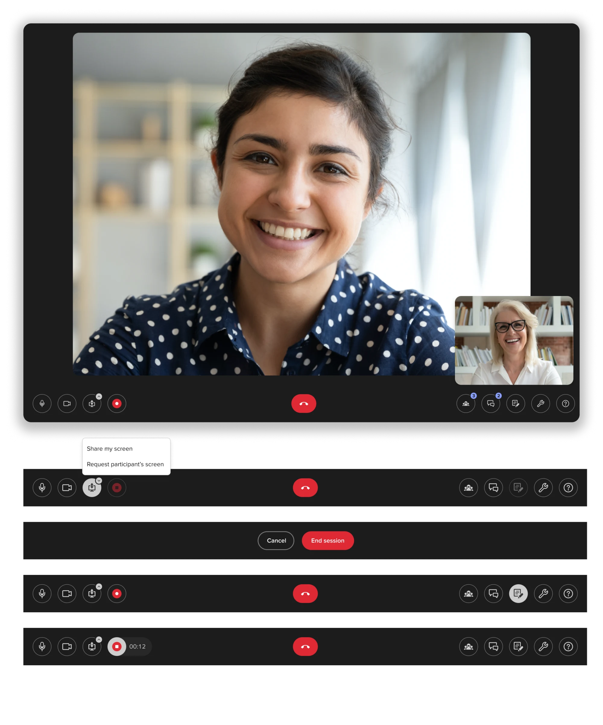
Thanks to the insights gathered from the research, we were able to iterate on the design and move forward. The rigid menu bar was integrated into the background, transforming into floating icons that give the UI a more modern and lightweight feel. The screen-sharing icon was updated to a double-sided arrow to better represent its dual functionality. Additionally, the notes icon now includes a pencil to prevent confusion with a calendar.
Below are various menu states, highlighting the most important elements of the UI at a glance.
Approaching the sidebar
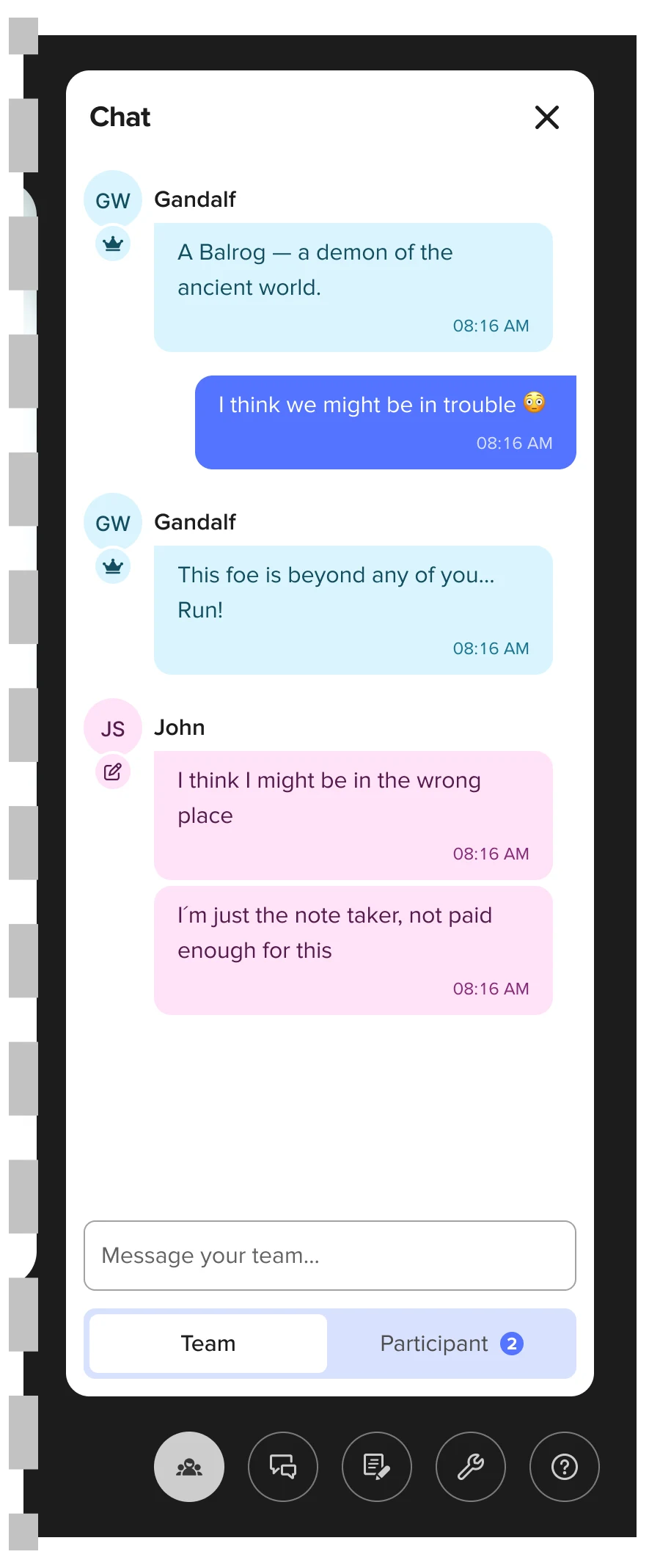
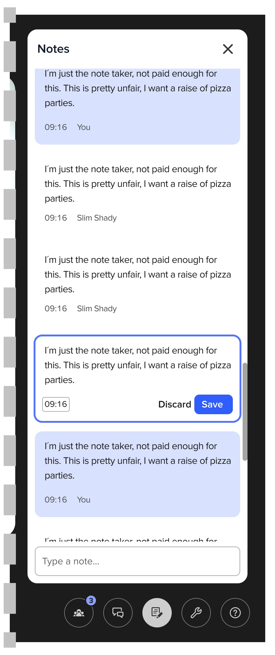
The sidebar is a dense surface in its own right, so this round was scoped on purpose: establish its direction and resolve the two features most tied to it — notes and chat — with the deeper pass left to a later iteration. It became a floating element over the background, which loosens the rigid grid and lets features and layouts transition more fluidly.
Chat gained a tab menu, so Moderators, Note-takers and Observers can switch to the participant thread — though only the Moderator can post there. Notes carry their author and timestamp, both editable from a three-dot menu.
Conclusions
The redesign of the Live Conversation feature successfully guided the UI toward industry standards, improving usability through recognition-based interactions and modernizing the interface to align with the new design system. While not fully completed, the project laid a strong foundation for a more intuitive and seamless experience for users from both UserZoom and UserTesting.
Through research, affinity mapping, and usability testing, we gathered valuable insights that directly informed design decisions, ensuring that changes addressed real user needs. The transition from a rigid layout to floating elements enhanced flexibility and improved navigation, making interactions feel more fluid and natural.
At this stage, my role in the project concluded, with the final designs serving as a solid starting point for further development and refinement.