Navtask Redesign

Project Overview
Usability testing is one of the key features of the UserZoom platform. During a test, participants complete a series of tasks while their camera and microphone capture their interactions. Before starting, they go through a pre-study checklist to ensure their device is properly set up. Once ready, participants are presented with the first task, along with a brief explanation of the floating navigation taskbar functionality (which lends its name to the project). While users recognize the significant value of usability testing, there are certain pain points that need to be addressed, as well as opportunities for improvement.
Goals
  • Update the outdated UI design to enhance the overall experience
  • Help participants quickly orient themselves during usability testing to reduce frustration
  • Prevent skewed usability test results due to a poor user experience
Approach
This redesign covers both mobile and desktop experiences. However, since mobile tests are conducted more frequently, and user trends indicate a growing preference for mobile in the future, we have adopted a mobile-first approach to ensure optimal usability across devices.
Old user-flow analysis
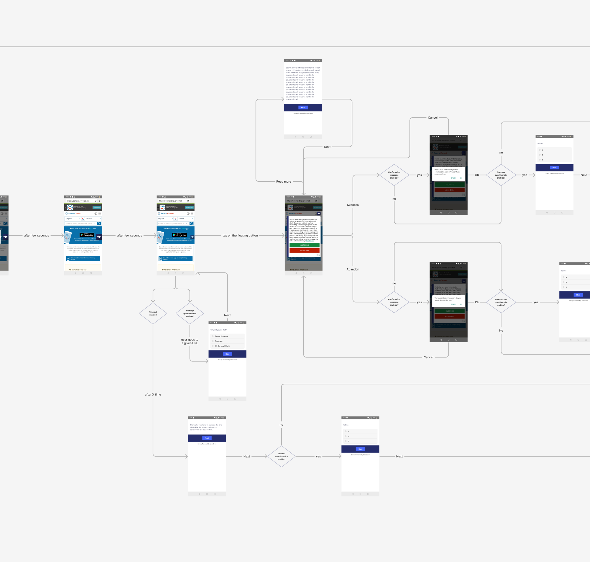
To kick off the redesign, I first reproduced and analyzed the initial user flow to better understand all the steps users went through. This process helped me gain a clear overview of the screens that needed to be redesigned and allowed me to create a board to document questions and issues. Additionally, I discovered that multiple user flows exist based on the various options available in the ‘builder’ section of the UserZoom platform, which is used to create Usability Tests and other studies. Below, the primary flow is illustrated.
The part of the flow where most of the issues are concentrated—and where I will focus my efforts—is the interaction with the navigation taskbar (hereafter referred to as navtask). In this stage of the flow, users need to complete their assigned tasks; however, multiple screens may appear depending on the study settings, such as timeout questions, intercept questions, or if users choose to revisit the task instructions.
I leveraged valuable insights previously gathered by the research team through user feedback and interviews with usability test participants. Interestingly—and somewhat ironically—we also collected insights from usability tests conducted on participants who were themselves involved in usability testing, creating an almost inception-like scenario.
Problems and pain points synthesis
  • The visibility of the navigation taskbar (navtask) is not optimal
  • Instructions for using the navigation taskbar are presented at a rushed moment and disappear too quickly, leading to confusion
  • The design of the navigation taskbar and modal UI is outdated and inadequate in certain aspects
  • Clicking on “Read More” redirects users to a different screen, often, just to continue reading the same text, which disrupts the experience. Additionally, the displayed text may vary depending on the settings selected in the ‘study builder,’ potentially causing further confusion
  • The main button’s copy is not aligned with UX best practices, impacting clarity and usability
  • When participants start the task, there is no clear reminder that their camera will begin recording
  • Participants often forget to think out loud during the test, as the reminder provided is too subtle to be effective
A new floating button
According to the priority set by project management, the floating button was the first element to undergo the redesign. Several button variations were tested, with different shapes and icons. I also conducted some creative experiments to enhance the brand identity of UserZoom.
(The little owl button was too disruptive 💔, but the UI team loved the proposal)
New navtask
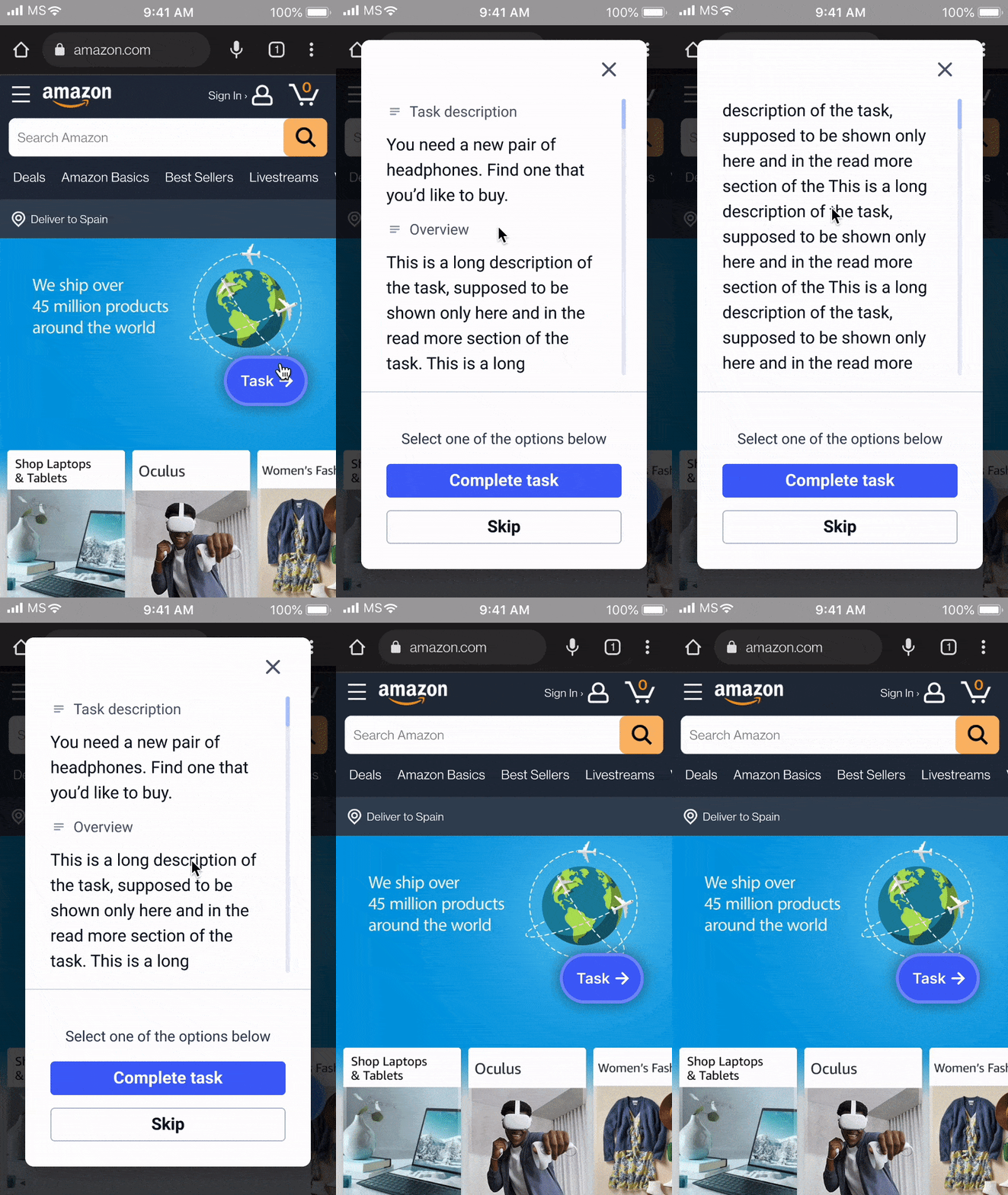
The new button features a bright color with an outline that enhances contrast and differentiates it from the background. Additionally, a subtle drop shadow effect helps distinguish it from the underlying screen elements. The button can float along all the edges of the screen and automatically snaps to the nearest border when released in the middle. Usability tests revealed that the icon featuring an arrow is the most easily understood by users.
Modal redesign
After redesigning the navtask, the next step was to tackle the modal that opens when users interact with it. Several options were considered, exploring three different ways of displaying the information—tab menu, accordion, and simple scroll. Additionally, various elements within the modal were evaluated, including the task description, buttons, think-out-loud (TOL) reminder, and camera controls.
KISS! (keep it simple, stupid!)
After conducting usability tests and follow-up user interviews, the winning solution turned out to be the simple scroll. In this case, simplicity triumphed over tidiness, as the majority of participants preferred this straightforward approach.
UI refinement
The new modal now occupies the full screen area instead of only a portion of it. The text size has been increased to enhance readability and improve accessibility. A new minimalistic, animated icon replaces the old microphone icon as a think-out-loud (TOL) reminder. Additionally, the buttons are larger and follow a more consistent color palette, which has been established as the new standard in the UserZoom Design System.
Onboarding and Start
The onboarding and test initiation have been combined into a single, cohesive process that helps participants understand how to navigate the interface during the study while concluding with a crucial reminder—the test task itself.
Step 1: Introduction and instructions
Before the test begins, participants are first presented with the Overview, followed by the Task, providing a structured introduction to what lies ahead.
Step 2: Onboarding process
The onboarding process consists of two dedicated screens, each featuring a short text description that explains the actions, paired with a pausable animated GIF that visually demonstrates them. Participants can skip the onboarding, which is shown only during the first test of the study to prevent unnecessary repetition in multiple tests within the same study.
Step 3: Start task screen
The Start Task screen presents the task description clearly and concisely, accompanied by a live preview of the phone’s camera—if recording is enabled. Once the participant clicks Start, the task begins and the timer starts running.
Responsive design: horizontal and tablet
With the design process for the initial screens complete, it's now time to create documentation and adapt the layouts for horizontal and tablet views. These versions will follow the same structure established for the mobile design, ensuring consistency across all devices.
Desktop
Now it's time to tackle the desktop design. The increased screen space allows the design to breathe more freely. The onboarding process undergoes slight adjustments, as does the interaction with the navtask. Additionally, the positioning and size of the modal are adapted to better fit the new desktop screen requirements.
In the desktop version, the margins within which the navtask can be moved are adjusted, and the modal adapts to different screen sizes, aiming to remain as unobtrusive as possible.
Exploring for next iteration
Staying focused on the sprint goals is essential, but when new ideas emerge and there's room for exploration, it’s worth taking the opportunity. This attempt aims to make the onboarding process even more intuitive and introduce additional features for the desktop version—perhaps something to consider for the next iteration.
Conclusions
This project has been both complex and stimulating, offering the opportunity to explore interesting interaction elements within the unique environment of usability testing. Designing for this context means serving not just one user, but two distinct groups—the study creators and the participants—each with their own needs and expectations.
Despite the seemingly few elements at play, the risk of failure is high if any component is not carefully designed and positioned. This challenge has reinforced the importance of precision and clarity in every aspect of the user experience.